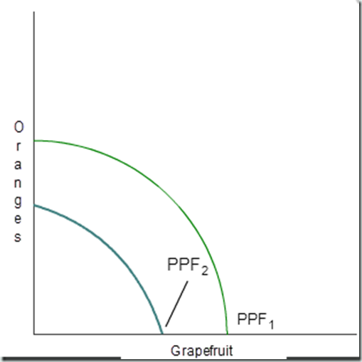
Consider the production possibilities frontier (PPF) that shows the trade-off between the production of oranges and grapefruit. Suppose there has been a disease in the area that kills citrus trees. Make a drawing to show what the PPF would look like before (PPF1) and after the citrus tree disease (PPF2).

The production possibilities frontier (PPF) is a curve that shows the maximum attainable combinations of two products that may be produced with available resources and current technology. The point where the curve touches the y-axis (the vertical axis) indicates how many oranges could be produced if all of the focus was on producing oranges and none of the focus was on producing grapefruit. The point on the x-axis (the horizontal axis) indicates how many grapefruit could be produced if zero oranges were produced. All the points along the curve indicate different combinations of orange and grapefruit that could be produced efficiently. Points outside the curve are not attainable due to scarcity; enough resources are not available given the technological and production constraints that currently exist. An advancement in technology could shift the PPF out and make it possible to produce more oranges and grapefruit at one time, although that is not the case in this particular example. In this example a citrus disease has impacted the production of both oranges and grapefruit. This is why PPF2 has shifted inward from PPF1.
Why do the curves look like this? Due to the citrus disease, production has become more limited. Taking a look at the x-axis, we can see that fewer grapefruit can be produced than before when the production is focused completely on grapefruit (zero oranges are produced). Likewise, if we look at the y-axis, we can see that if all production is focused on oranges that fewer oranges can be produced than before the citrus disease (zero grapefruits are produced). At all points on PPF2 the combinations of oranges and grapefruits that can be produced are lower than on PPF1 due to the citrus disease.
Comments
Post a Comment